Saturday, 25 December 2010

Art of the title: Kung Fu Panda


The opening sequence for 'Kung Fu Panda' only features two pieces of text; the first is the 'Dreamworks' intro and the second, the title of the film: 'Kung Fu Panda'. This may seem very basic but considering the target audience of the film is children, it is actually quite relevant. Children wouldn't appreciate seeing actors names who voice-over the characters, but would rather be introduced via colourful pictures. The text which you would find in a thriller movie opening sequence will be different to that of a film aimed at children. The text is either replaced by images and sound, or is not particularly important and so is left out entirely. Also, some children may not be able to read, or may not be strong readers, so having a lot of text in the opening sequence would be irrelevant. There also a voiceover which, again, replaces the text in the opening sequence.

The design of the titles is very cartoon-like. This shows the audience who the film is aimed at, as cartoons are usually watched/read by children. The shapes and colours are sharp and contrast well with each other, so that the images can be easily understood by the younger audience. The opening sequence consists mainly of the primary colours and black which keeps it simple, and considering other films use basic images (so that the attention is more focused on the text), it works well using an opposite method for a younger audience. There is an element of manga in the opening sequence which is also incorporated in some childrens cartoons (e.g. Pokemon). It also tells the audience that action is a main theme of the film and that the film is set in china, as manga and manga style cartoons originate from the far east.

The first piece of text is the 'Dreamworks' intro which is themed to suit the film by using a gong song effect and also a light reflection effect to make it seem as if a sword has struck and split apart the image from the text. This introduces the martial arts/action theme, along with the name of the film; 'Kung Fu Panda'. The next piece of text is 'Dreamworks Animation Presents' in the same style as the 'Dreamworks' intro, which builds up excitement for the start of the film, and also advertises the institution. The next and final piece of text is the name of the film: 'Kung Fu Panda' which is in large bold letters to make it stand out.

The trailer is overall very visual which suits the target audience well, as they could still be in early learning stages, or just coming to terms with learning to read. Text is not particularly necessary in this opening sequence as the audience are more suited to seeing images instead of reading text. The cartoon style images and the voiceover introduce the film better than text.

Hannah : )

Wednesday, 15 December 2010

Art Of The Title


The order of the titles for ‘The Incredibles’ film firstly shows the title of the film. The executive producer, music producer, character design and effects supervisor are also included and mentioned during the opening sequence. Also images which are related to the film are included such as the running figure above the executive producers name which is one on the characters (Dash) and shows his super power to run fast (Hence his name). Also the image of the red haired boy figure again shows the characters super power. The character image which is used in the character design slide shows the style of graphics used in this film. The strong reference to super hero’s throughout these opening titles indicates the theme, genre and story line of the film. 

Ellie <3 

Art Of The Title

Edward Scissorhands contact sheet
The opening sequence to "Edward Scissorhands" begins with the main production name "20th Century Fox" in the credits but as most films do, they have added a different effect over the title; dark and snowy. This relates to the film because it's always snowing in Edward's home because of his work which eventually leads to snow everywhere because he gives them it. The next effect would be the title of "Edward Scissorhands" which is using a black background to emphasize the effect of the long white writing which is known with Tim Burton (the director) because he uses this with most of his films such as Corpse Bride and Nightmare Before Christmas. The following shots  contain actors, casting crew, production designer, screenplay writer and obviously the director; Tim Burton. All names are written in this same writing but use images that would stand out from the film  of things such as scissors and shapes (things he creates). I think this is quite effective because it ties to the director and his own style which has been massively put into the film. 


Kelly <3 

Art Of The Title


This title sequence for the film ‘Sherlock Holmes’ includes images of the characters so the characters are briefly introduced during the opening sequence of this film. The use of graphics and the colour scheme sets the genre and theme of the film. The producer names for different aspects of the film are included. For this film the order is; screenplay, executive producer, the title of the film, actress Rachel McAdams, music producer, Warner bros production. 

Ellie <3 

  Play video till 1:06
A suitable film opening for us to research was 'Legally Blonde'. However we were only able to find the video above which includes only a small taster of the aspects which we are aiming to include in our opening scene. These aspects include the girl brushing her hair indicating that she is very aware and involved in her appearance. The movements in the scene are slow and focused this is the kind of image we want to achieve. The mood created (stereotypical drama filled teen)

15/12/10 Diary Entry

Today we presented our blog containing all of our research into target audience and marketing strategies. We received feedback from Michelle advising us with possible improvements. As a result of this we have and will continue to add more images into our blog to give more of a "sketchbook" look and visual element than looking like an essay.
  We have decided that our diary entries will be written in the style of teen girls because we are trying to relate to our characters and relate to their mindset.


Kelly + Ellie :)

Wednesday, 8 December 2010

Advertising and Marketing

Advertising and marketing play an important role in creating a successful film. Without advertising, the target audience would be unaware of it so we need to find a suitable way of advertising so that it would be noticed by the aimed demographic. For our target audience (teens) we would need to publish our film in places such as magazines, social networks and radio reviews.


Magazines
Magazines are popular media resources for many young teenagers, especially amoungst young girls. For our film, teen magazines would be a prime advertising location as we would attract much interest from the correct target audience.
Popular teen magazines such as Bliss, Shout, Mizz and Sugar are the main places where we would advertise because they have the same target audience as our film, so we would both be relating to the same group of people.


A new modern online magazine - Slink, provided by the BBC, would also be a suitable place for advertisement. This website is very interactive and dependeant on the points of interest of their audience so allows views on topics and encourages points of view to be expressed. Therefore we could create a discussion forum on the BBC slink website, which would both advertise and encourage our film to be a talked a bout topic amoungst a young audience. 


Shops


Advertisement in shops such as New Look, Claire's Accessories and possibly Primark is also a possible way in which we would make people aware of our film. An example of how we could advertise in shops would be using images of the actors in our film wearing items from this shop, this would put our film out there and also advertise the shop. This marketing strategy is known as synergy.

Radio
A film review on a radio station such as Radio One would help raise awareness and interest for the film as the audience of radio one is young people. We could also use stations such as Kiss because they tend to be popular with young teens because a lot of the music is aimed at the same people we aim our film to.

First Pitch - 25 words

A geeky, unsocial reject faced with the jungle atmosphere of a new high school, confronted with the queen bee; Georgina Richards. Can she handle it?


This is a short summary of our whole plot which we decided to interpret as a jungle by using phrases such as "queen bee" (which shows status) to make the overall high school experience seem hectic and dramatic.

Wednesday, 1 December 2010

Genre Related Openings


while researching our genre, we found Juno; a teen comedy based on teenage pregnancy. We discovered  that this wasn't exactly what we wanted when it came to our genre because she isn't the same stereotypical teen that we expect to show in our film. However it is useful by showing what to do in our work to make it redundant for teens.

Initial Ideas

A group discussion lead us to our first initial idea that our opening scene could start by using mise en scene of girls applying their makeup. The use of close up would show the intensity and that make up is an important aspect for their appearance, it creates a stereo typical and superficial image of teenage girls. From watching films like mean girls audiences in this age category already know that a typical beautiful teenage girl would generally have the higher status amongst pupils so by opening a film in this way, it would already inform the audience of the basic storyline preparing them for the coming drama.


                  Image from 'Wild Child'                                             Image from 'Mean girls' 
 These two images strongly the typical image of teenage girls. From these images we are able to collect inspiration for costume and props which we could possibly use in our opening sequence. 


Teen Genre/Market

Each member of our group researched similar film openings after discussing and deciding our overall genre would be teen. We mainly focused on "girly" films, our target audience is teenage girls aged between 13-19 year old. We did some research on the U.K film council website where we discovered audience by gender and who goes to see what films. We found the 78% of the audience of Marley and Me were female and only 22% were men, Marley and Me is a girly kind of "chick flick" which is the kind of style that we want to do. We also saw that the majority of people that go the the cinema are aged between 15 and 24 which covers most of our target audience. 


Marketing of Mean Girls
Mean girls was released in cinemas on April 30, 2004 and attracted a large audience from tweens to teens. We plan on going for the same audience group so we want to go for a similar approach. The screen shot below shows the data of Mean Girls in the US provided by the Box Office. 

As can be seen, Mean Girls was a major release in cinemas. However a new release is currently being advertised and we have found that it is going straight to DVD. This could be due to the great success of the first film of which this new sequel release is depending upon for people to buy the new film. The film trailer includes clips of the original film to make the audience remember how good the film was helping to create and encourage a high interest for this new release.  This is something we will need to consider as it would be suitable for the buyer to have the film in there own comfort of the home. 


Tuesday, 23 November 2010


At the very beginning of the scene we are presented with the institutions involved in making the film. This lets the audience see who it was made by. We are then presented with the names of actors/actress' and a number of people who helped make the movie, for example the director, producer. We then here a mysterious kind of music before we even see any kind of image, this leaves the audience not knowing what to expect.


The first image we see is a point of view shot, talking to a mother a father however we don't know who's point of view we are seeing, this hooks us to the scene we want t know more, we want to know who the character is. We are made to believe that is a small child on their first day of school however we are soon presented with a teenage girl then also makes us want to know more. A narration of the main characters voice is then heard which talks us through the opening telling us some background information of the character.


The opening then sets the time and place, we see her go to school and it soon becomes clear that the film is going to be about this girl and her school life. We are then introduced to other important characters in the movie, the girls friends and teacher etc. We get a kind of bouncyy fun but also cringey feeling from the film, it becomes obvious this film is a kind of chick flick.

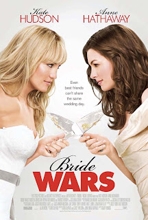
Bride wars: opening scene :)

The opening title sequence of Bride wars starts off by showing the audience institutions which are involved in the film. Happy music is played whilst these are being shown which gives us our first indication of the genre of the film, (obviously not horror).  The use of this happy music sets the mood of the film to be happy and light hearted.
    Throughout the film’s introduction, names of actors and the cast are shown whilst the camera pans over various wedding related objects. In this particular film two well known actresses are used; Kate Hudson and Anne Hathaway.

    The first visual shot is a close up of a treasure box, labelled wedding things which instantly sets the theme of the film as wedding based. A second close up shot of the box being opened has a soft focus which gives the treasure box a soft, elegant, precious feel.
    When the box is opened we see that the content is full of wedding related items strongly reinforcing the theme of the film. This use of mise-en-scene is a strong element to the opening titles of this film as many wedding related objects such as a lace veil, a wedding cake, a ring which is put on a finger, a tiara and a glittery girly bracelet.
    There are several shots of a bride and groom figures which are being played with throughout the opening titles. Only hands are shown in these shots so no characters are introduced to the audience. The first reference to the bride and groom figure is a front view shot and shows the figures side by side as if they are walking down the isle of a church. This reference to the bride and groom figures is when they are stood facing each other as if saying their vows. The third reference is when they kiss. And the fourth is when confetti is sprinkled over them and the fifth and final reference is when they walk away from the camera as they supposedly walk back up the isle as a happy married couple. Despite the fact that these references are at different points of the opening titles it does tell a continuous story of a wedding.
    So far in the opening sequence of this film we have had no introduction to the characters but it has been implied that they are children due to the playing shots of the bride and groom figures. The following shot of children’s crayon drawings of two brides supports our implication that the two characters are two young girls.
    Through the use of mise-en-scene one of the items shown is a photograph of two young girls together; this is a subtle introduction for the audience to the characters. We are shown two children drawings/art pieces which are wedding related. This is the second subtle introduction to the characters as each of the art pieces has a name on; Emma and Liv. A locket with two girls in is a third subtle introduction to the two characters.
    
So far only music has been played throughout the opening titles. There is a slow zoom in on an image of a big stately home at which point a narration starts. This shows an introduction to the location of which the film is based around.
    There is a sequence of images of the two young girls which are zoomed in on slowly. This is the first proper introduction to the characters behind the story line. Although these shots are still images with a soft focus a story is still told as it is consistent with the narrative.
    Now that we are introduced to the characters and the story line we have a shot of the two young girls in an attic with childlike surroundings, playing together. This shows the location of the mise-en-scene shots of the wedding related objects at the beginning of the film.
    From these opening titles of the film, the audience instantly know that this film is going to be a chick flick, girly wedding based film. 

By Eloise Maidment

Sunday, 21 November 2010

She's The Man: Opening Scene (:

At the beginning of She's The Man, before it even goes into introducing the makers of the movie, it shows you the industry in which it was made and the institutions involved. I think the fact it is shown at the very beginning is important and because it is played with an audio already, it just gets stuck into it straight away! The audio is played throughout the whole of the opening scene which I really like because it's like there is no speech needed because the audio and actions show the characters as they are already. Cleverly, at the same time as the audio, they show the names of the people involved in the film which I think looks quite good because the writing is shown in a flashy white text that stands out, especially the fact they freeze the frame when the names come up. 


I think the main "hook" of the opening scene would be the music because it just ties everything in together. The mood of the film is shown as quite happy, loud and original for a teenage summer day which I think if the music hadn't been added; this same affect wouldn't have been picked up so easily. It also shows the overall theme of the film as quite teen like; fun for everyone really. 


Another effect of the music would be setting the movie as modern because the music is up to date so it just shows you that the language and overall make up of the movie would be things that teens nowadays would recognise as things they understand themselves and have experienced. 


I love how the main task in the opening scene is football because some of the audience could see this as just a normal day at the beach but as you carry on watching the film, you realise that football is a massive part of the film and how it's all about standing up for yourself and proving you are good enough; which is a good moral for a story and by putting a moral in a teen movie, i think its quite impressive because it shows the modern teen that they can do anything by putting their mind to it as well. 


Kelly Sutton (: 

Wild Child Opening Sequence

The first shot is of a bright blue ocean which looks like a typical american beach in summer. The second shot is of the main characters room which looks quite expensive because of the cream and blue colours. This also implies she is quite spoilt. The mise-en-scene tells the audience that she is a bit of a girly girl because she has fluffy pink pillows on her bed. 


The first word said by the main character is a swear word which shows she is quite rebellious and doesn’t stick to the rules. The main character is stood in front of a large group of friends which tells the audience that she is ‘popular’. The shot where her sister is up on the balcony looking down shows that she is more mature than her older sister, and therefore makes Poppy look immature and childish. The scene where she jumps into the ocean shows the audience that she likes to be centre of attention and likes to make a scene. When her dad appears the music stops which suggests that he is in charge and all his daughters shenanigans stop when he is there. She also argues with her dad which shows she has a bit of an attitude.


The main hook in the opening scene is that Poppy’s step mum is moving in and her and her sister don’t like her, but then Poppy’s dad threatens to send her to a boarding school in England. This is a dilemma because she is so spoilt and it putting her in a strict english school would be a problem, so it makes the audience want to watch the rest of the film.


The first bit of music in the opening sequence is a song that sounds like it’s from a music box which makes the audience think she is similar to a ballerina or a princess, but this is not the case as they later find out. It gives the film a light-hearted tone and suggests Poppy has a perfect life in Malibu. The second bit of music is the song “Shut up and drive” by Rihanna. This song is quite representative of Poppy’s personality and attitude, but also it sounds like a ticking clock which suggests she is up to something. Also the general colour palette is very bright and colourful which lets the audience know the mood and tone of the film.


By Hannah Price : )

Wednesday, 10 November 2010

Preliminary Exercise - Dialogue/Camera Shots and Stage Directions

In this blog we have included the shots we will use, the exact script and stage directions. We did this so when we got to recording we knew exactly what we had to do because we had it all planned out.

SCENE 1

             *Over the shoulder shot - DOCTOR to RELATIVE* 
DOCTOR: Mrs Taylor? (stands) 
             *Side - two shot* (both sit down) 
             *Over the shoulder - RELATIVE to DOCTOR* 
DOCTOR: I'm sorry, it's bad news. James's results have shown he is unlikely to  
              recover. 
             *Over the shoulder - DOCTOR to RELATIVE*
RELATIVE: I, I don't understand.. he's fine 
             *Over the shoulder - RELATIVE to DOCTOR*
DOCTOR: We've done all we can, his body has become too weak to respond to
              the medication, we're really sorry.           
             *Close up RELATIVE* (reacts) 

SCENE 2
              *Long Shot from front of RELATIVE - Tracking*
               (Slow, same facial expression, lifeless)
              *Mid shot as sits down
              *Mid shot still as hands are over face
              *Close up with eyes shut
                (White light fades over RELATIVE) 
               
SCENE 2 - PART 2
              *Mid long shot*
              (PATIENT lead down) 
              (RELATIVE sat legs to side)
              (Play fight - Laughter)
              (White light fades out) 
              * Close up* (eyes open, wipes tears)

SCENE 3
              *Close up, (hand on outside of handle)* 
              *Long shot* (Door open - Inside)
              *Close up * (Head on door for a sec, takes deep breath)
              *Close up* (Hand letting go of inside handle)
              *Over the shoulder, PATIENT to RELATIVE*
              (She turns and sits down)
              (She looks hopefully and happy, he looks doubtful) 
RELATIVE: How're you feeling?
               *Over the shoulder RELATIVE to PATIENT*
PATIENT: (Looking sad, Shaking head)
              I know i'm not ok, just tell me. What did they say?

END.

Sources Of Inspiration

Our theme for this task was "Hospital Drama". To be able to do this we had to research clips from previous episodes from programmes such as Holby City and Casualty.


From this we learnt that the main things used to make a hospital drama are things such as tension, emotion and tragedy; we would have to place these elements in our piece so it stood out under this category. By doing this we had to take into consideration, how people react when faced with these elements. For example, when the scene is very drama filled the pace would be quite fast to keep the audience alert and aware of the situation. 

Wednesday, 29 September 2010

More examples of Camera Shots

http://www.youtube.com/watch?v=HQQ8kXfn9Iw&feature=related

we chose this because we think it was a great example of mixing a flash back with the present.

Camera Shot - Tracking and Close Ups


This clip shows tracking characters and also intense close ups the show emotion and reactions. 

Wednesday, 22 September 2010

Final Dialogue

We had to change some of the dialogue so it flowed better and became more realistic. We didn't exactly follow the script we had to decided to use because we just found it easier to go with the flow while recording, this made it seem more natural. :)

FINAL - "Phonecall" - Ellie, Kelly, Alice and Hannah

Our final edit went quite well because we cut out various shots that didn't work very well or didn't look right compared to the rest. We had to cut out some of the original footage that was suggested to do because it didn't fit well in the sequence but ended up looking a lot better than the rough edit :) 

Rough Cut of "Phonecall"

Today we completed a rough cut of our video, "Phonecall".The hardest thing to do was organising the shots and cutting them to be exact. This was hard because we didn't use a clapper board to clearly distinguish each shot. This is an improvement we will make next time so it's easier for us when it comes to editing. Overall the mise-en-scene was a success!! :D 

Monday, 20 September 2010

Editing 'Phonecall'

Today we uploaded our work from the camera to the computer and began to edit it so it was all in order and we cut out the unwanted scenes. This was a lot more difficult than we thought it would be when it came to arranging the scenes smoothly. We needed to make it run properly not to fast or slow. 

Wednesday, 15 September 2010

Dialogue

Person 1: Hello 
Person 2: Hi, where are you? 
Person 1: I'm on my way, i'll be five minutes. 
Person 2: Okay, see you in a minute, bye 
Person 1: Okay, bye 

This was the dialogue we used and developed on while recording. We kept it simple so it was casual and realistic (like the settings). 

Location Scouting

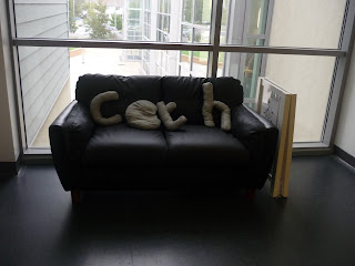
We chose this as an option for our location because it seemed like an easy place to work with and create a scene around. A complication with this scene would be that obviously we can't control the lighting in this area so we would have to consider weather conditions when it comes to the 'mood' we want to create in the scene. 


We chose this location as a possibility because it's somewhere realistic and gives the impression that the phone call was planned because it would be one person sat on their own. 


This option was a personal favorite of the groups because of the effect the lighting gives off. Also the shape of it is set for a certain genre because its long and narrow so it would be the perfect place to be watched or chased. 


This was also a main option because the lighting creates the effect of reality and makes it seem more casual which relates to the story.